A refined identity system for the future of valuation.
A refined identity system for the future of valuation.
A refined identity system for the future of valuation.
introduction
introduction
Praedes is a valuation company built on knowledge, ethics and precision.
Their work requires a rare combination of expertise, cultural understanding and trust.
Yet their visual identity did not reflect that depth.
Praedes is a valuation company built on knowledge, ethics and precision.
Their work requires a rare combination of expertise, cultural understanding and trust.
Yet their visual identity did not reflect that depth.
Share this
The brand felt fragmented and improvised, lacking the calm professionalism clients expect when entrusting valuable items, emotionally or financially, to a specialist.
Praedes needed an identity that matched the integrity of their service.
The Challenge
Valuation is not a visually expressive discipline.
It is a discipline of clarity, accuracy and restraint.
The challenge was to design an identity that:
communicates authority
inspires trust from the first second
carries cultural and historical awareness
feels modern without noise
and creates space rather than spectacle
The goal was not to embellish the brand.
The goal was to reveal its true character.
Core Insight
Clients make a judgment about credibility before any conversation begins.
This required an identity system that feels:
confident
knowledgeable
structured
calm
and principled
An identity where every element — colour, typography, spacing, symbol — supports the perception of trust.
This insight shaped every design decision.
Strategic Foundation
The new Praedes identity is grounded in five pillars:
Knowledge
Expressed through structured layouts and careful typographic hierarchy.
Ethics
Reflected in the brand’s restraint, clarity and balanced tone.
Excellence
Translated into precise geometry and a refined graphic system.
Exclusivity
Not in a luxurious sense, but in the sense of discernment, accuracy and considered detail.
Origin
Honouring the cultural and historical narratives behind each valuation.
These pillars inform both the main brand and its sub-brands.
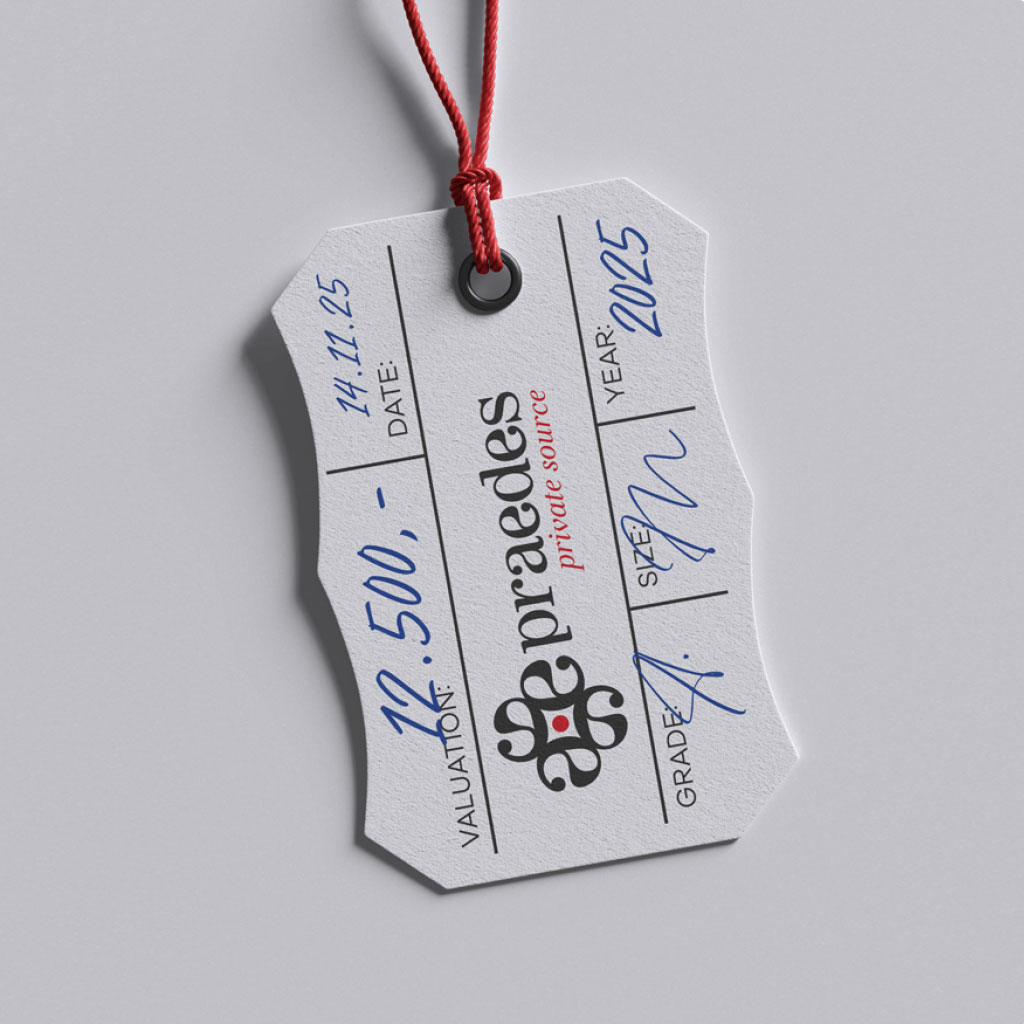
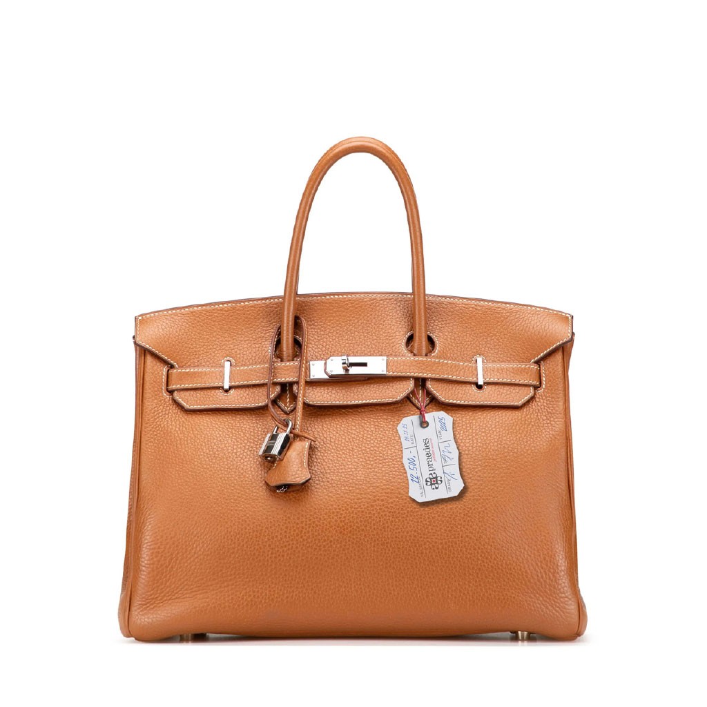
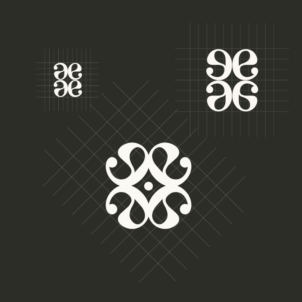
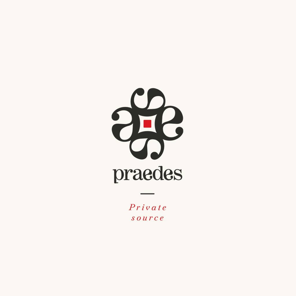
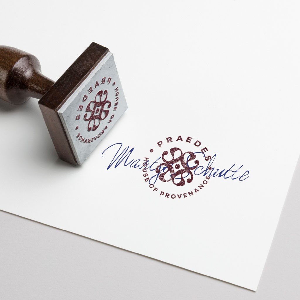
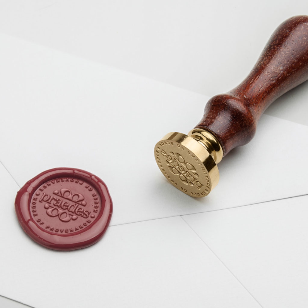
The Brand Mark: Four Mirrored E’s
At the centre of the identity is the new brand mark — a geometric composition derived from the two E’s in the name Praedes, mirrored and combined into a structured symbol.
The four E’s represent the foundational values of the brand:
Expertise
Ethics
Excellence
Exclusivity
The result is a mark that is:
timeless
balanced
symmetrical
deeply connected to the name
and uniquely ownable
It functions as:
a primary symbol
a seal of authenticity
a pattern element
a structural device in layouts
and the anchor for the entire system
Quiet confidence, expressed through geometry.
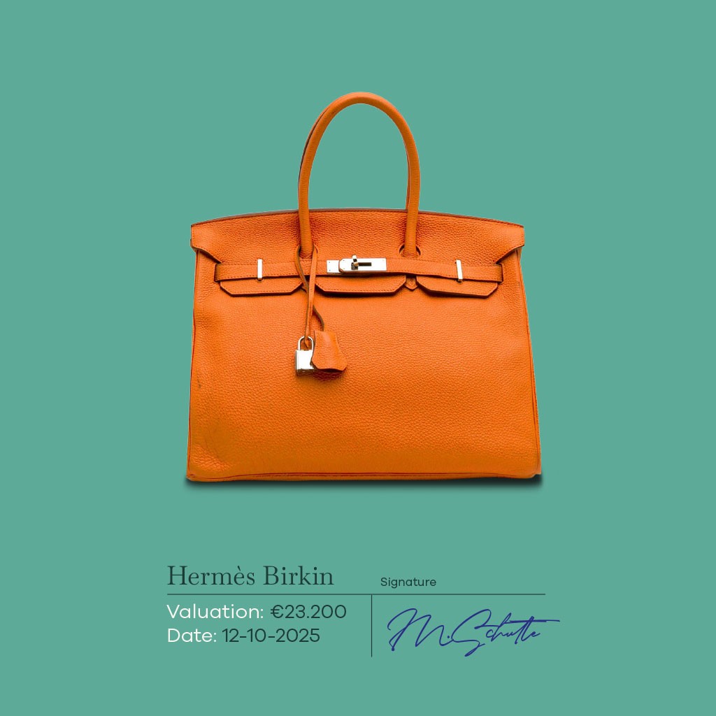
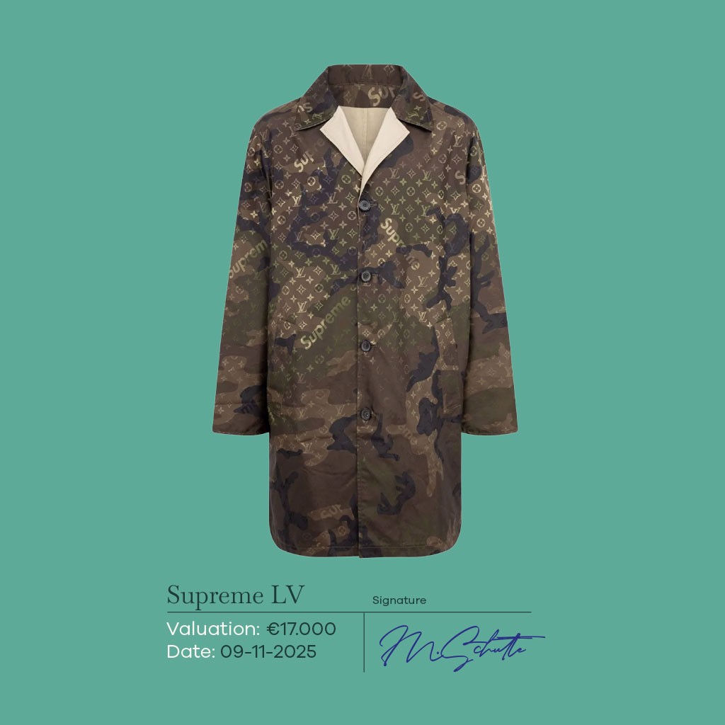
The Colour System
The colour palette is intentionally restrained and sophisticated:
Charcoal Paper
A deep neutral that conveys structure, reliability and calm.
Heritage Green
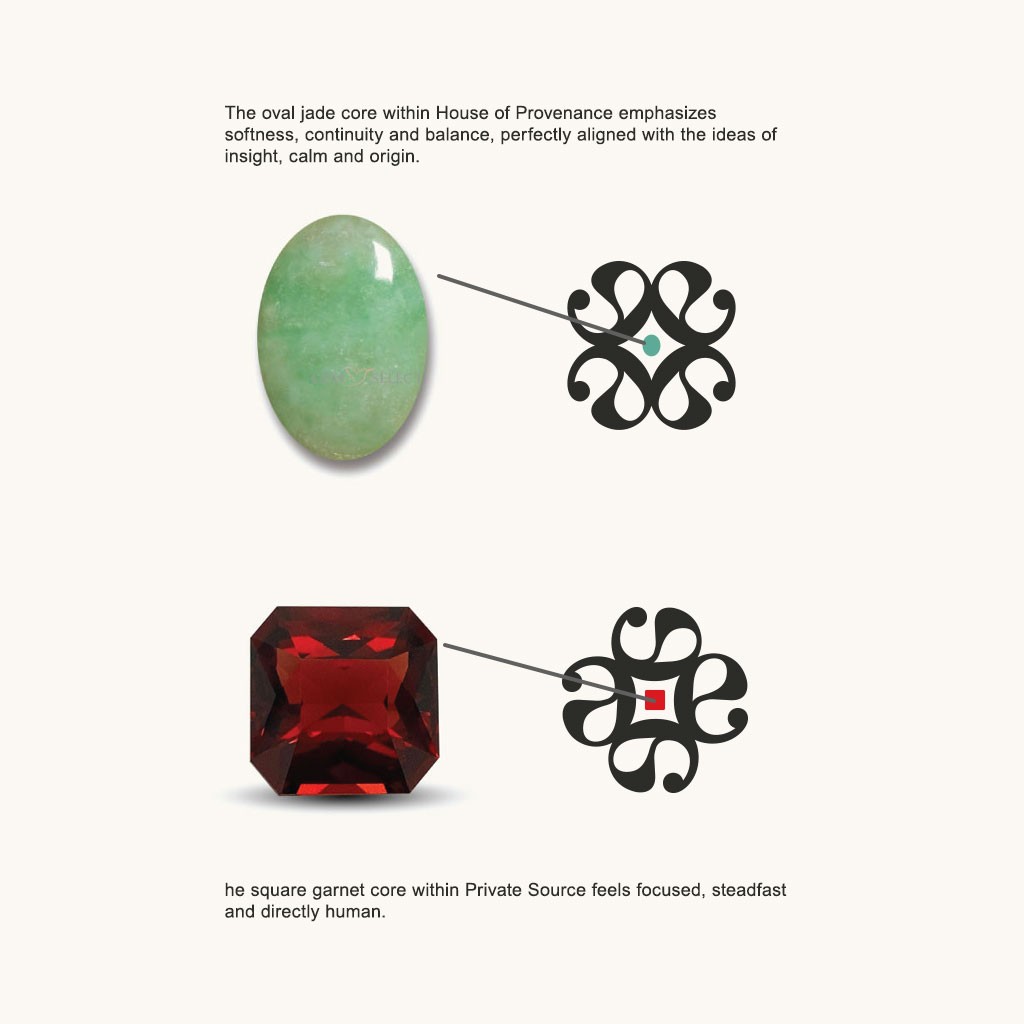
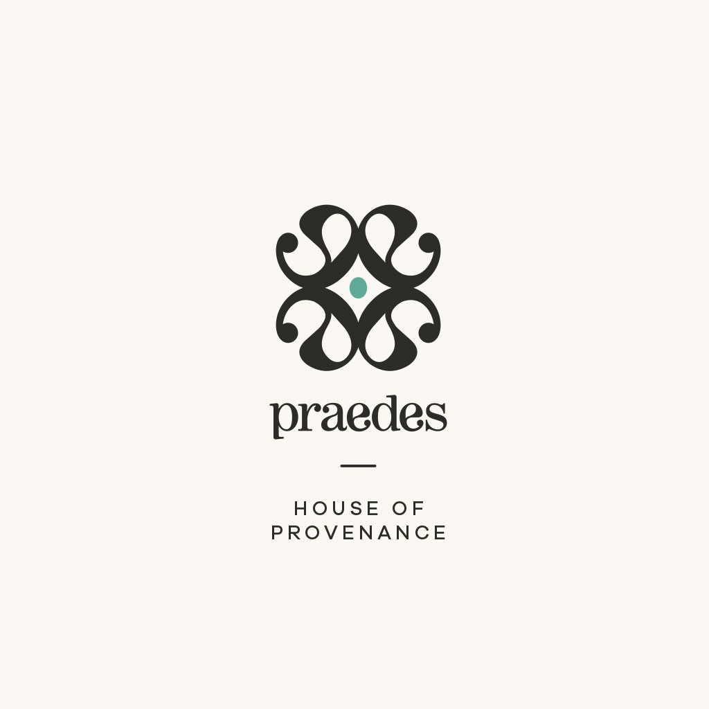
A grounded tone linked to knowledge, provenance and cultural depth.
Jade (House of Provenance)
A refined accent used exclusively for the House of Provenance.
Jade communicates continuity, preservation and the importance of origin.
Garnet Red (Private Source)
A confident accent unique to Private Source, signalling focus, rarity and personal curation.
Brass
A warm metallic tone that adds subtle refinement without slipping into ornamentation.
These colours create clarity and hierarchy across all applications.
Strategic Foundation
The new Praedes identity is grounded in five pillars:
Knowledge
Expressed through structured layouts and careful typographic hierarchy.
Ethics
Reflected in the brand’s restraint, clarity and balanced tone.
Excellence
Translated into precise geometry and a refined graphic system.
Exclusivity
Not in a luxurious sense, but in the sense of discernment, accuracy and considered detail.
Origin
Honouring the cultural and historical narratives behind each valuation.
These pillars inform both the main brand and its sub-brands.
The Brand Mark: Four Mirrored E’s
At the centre of the identity is the new brand mark — a geometric composition derived from the two E’s in the name Praedes, mirrored and combined into a structured symbol.
The four E’s represent the foundational values of the brand:
Expertise
Ethics
Excellence
Exclusivity
The result is a mark that is:
timeless
balanced
symmetrical
deeply connected to the name
and uniquely ownable
It functions as:
a primary symbol
a seal of authenticity
a pattern element
a structural device in layouts
and the anchor for the entire system
Quiet confidence, expressed through geometry.
The Colour System
The colour palette is intentionally restrained and sophisticated:
Charcoal Paper
A deep neutral that conveys structure, reliability and calm.
Heritage Green
A grounded tone linked to knowledge, provenance and cultural depth.
Jade (House of Provenance)
A refined accent used exclusively for the House of Provenance.
Jade communicates continuity, preservation and the importance of origin.
Garnet Red (Private Source)
A confident accent unique to Private Source, signalling focus, rarity and personal curation.
Brass
A warm metallic tone that adds subtle refinement without slipping into ornamentation.
These colours create clarity and hierarchy across all applications.
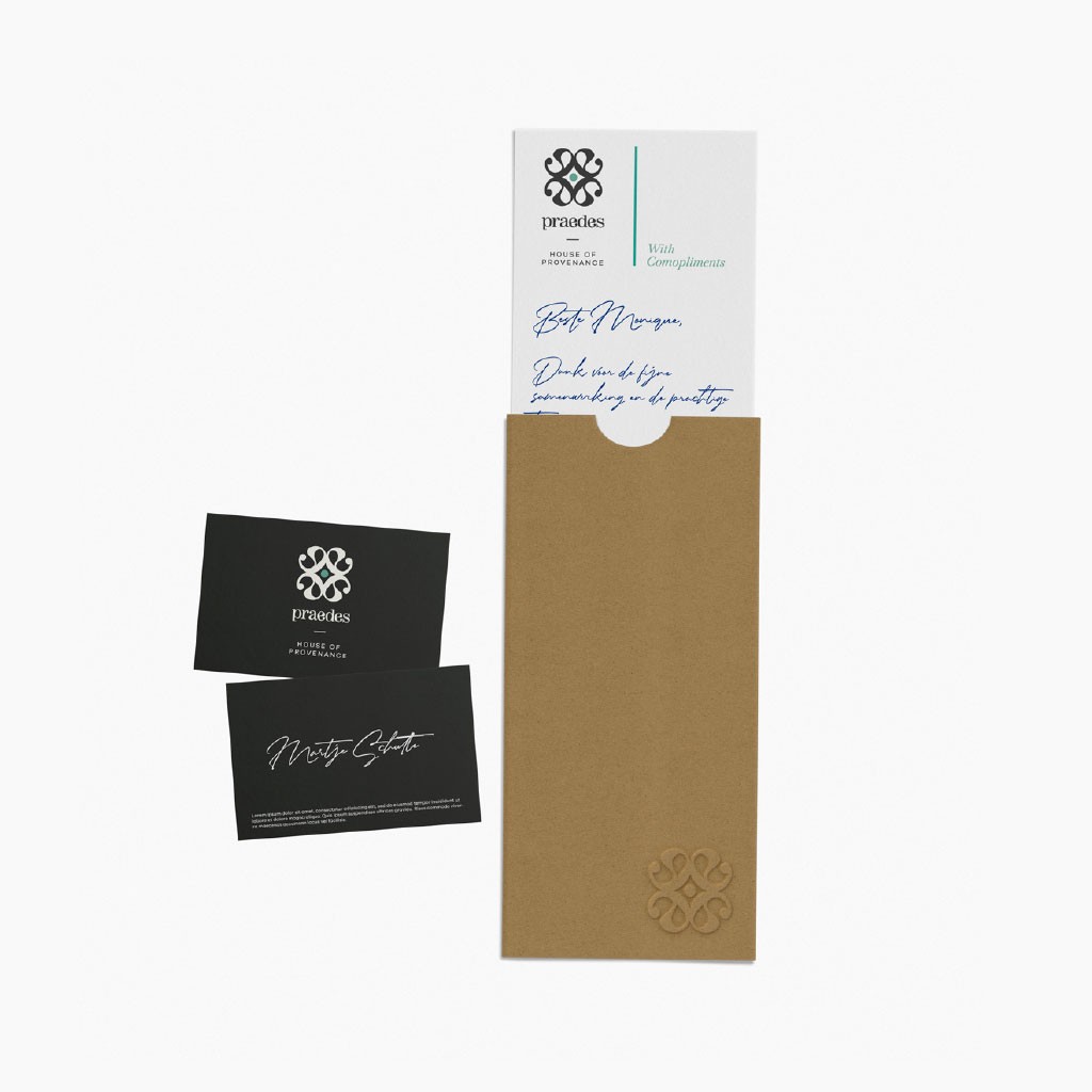
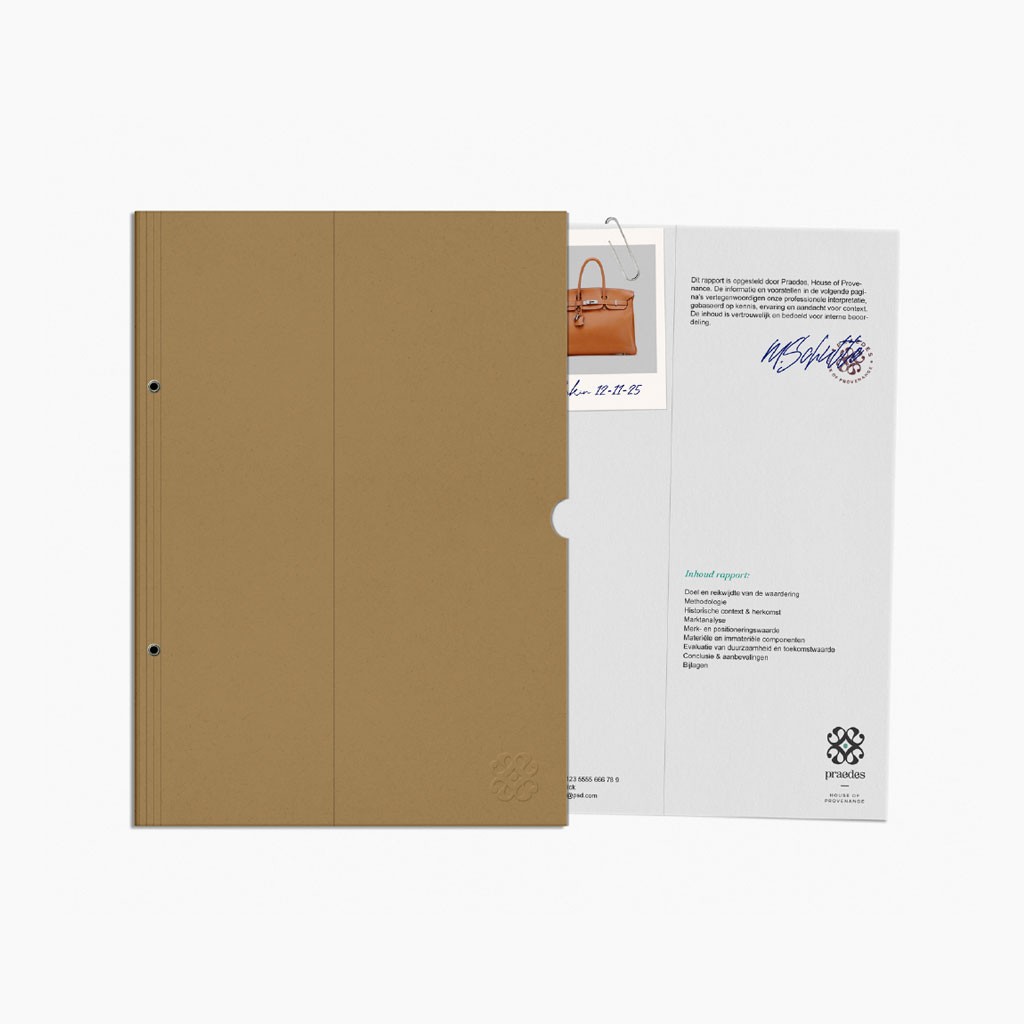
Brand Architecture
Praedes (Core Brand)
Calm, structured, knowledgeable.
The foundation for all valuation services.
Praedes House of Provenance
A sub-brand dedicated to heritage, documentation and continuity.
Marked by the Jade Oval, a soft geometric form representing preservation and cultural lineage.
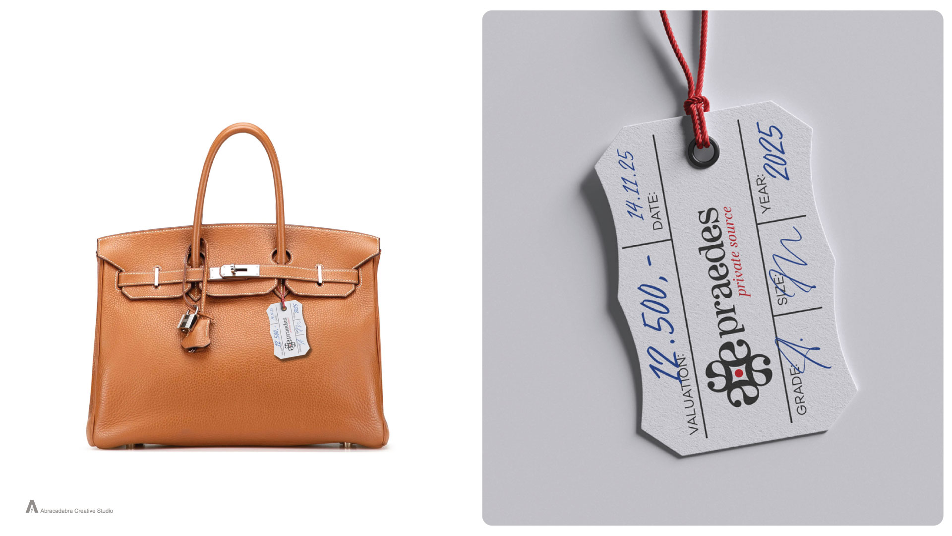
Praedes Private Source
A sub-brand for rare items, private valuations and discreet sourcing.
Identified by the quarter-turned brand mark, introducing energy, direction and intent — paired with the Garnet accent.
Each sub-brand is distinct yet seamlessly connected to the core through geometry, type and tone.
Typography & Visual Language
Typography is refined, measured and neutral — prioritising clarity and ease of reading.
Spacing is generous, layouts are structured and graphic elements are used sparingly.
The visual language is:
quiet
balanced
precise
intentionally minimal
Every component reinforces professionalism and trust.
The Result
The new identity elevates Praedes to the level of expertise they already possessed.
What changed:
trust is established immediately
the identity reflects knowledge and ethical practice
the brand architecture creates clarity for clients
each sub-brand has a distinct but connected purpose
layouts feel modern, calm and structured
the brand gains longevity and coherence
Praedes now appears as what it truly is:
an authoritative, refined valuation brand built on depth, discipline and cultural understanding.
Core Principle
A strong identity does not amplify a business.
It reveals it.
Brand Architecture
Praedes (Core Brand)
Calm, structured, knowledgeable.
The foundation for all valuation services.
Praedes House of Provenance
A sub-brand dedicated to heritage, documentation and continuity.
Marked by the Jade Oval, a soft geometric form representing preservation and cultural lineage.
Praedes Private Source
A sub-brand for rare items, private valuations and discreet sourcing.
Identified by the quarter-turned brand mark, introducing energy, direction and intent — paired with the Garnet accent.
Each sub-brand is distinct yet seamlessly connected to the core through geometry, type and tone.
Typography & Visual Language
Typography is refined, measured and neutral — prioritising clarity and ease of reading.
Spacing is generous, layouts are structured and graphic elements are used sparingly.
The visual language is:
quiet
balanced
precise
intentionally minimal
Every component reinforces professionalism and trust.
The Result
The new identity elevates Praedes to the level of expertise they already possessed.
What changed:
trust is established immediately
the identity reflects knowledge and ethical practice
the brand architecture creates clarity for clients
each sub-brand has a distinct but connected purpose
layouts feel modern, calm and structured
the brand gains longevity and coherence
Praedes now appears as what it truly is:
an authoritative, refined valuation brand built on depth, discipline and cultural understanding.
Core Principle
A strong identity does not amplify a business.
It reveals it.