IHMS Case Study
IHMS Case Study
IHMS Case Study
introduction
introduction
The International Holland Music Sessions (IHMS) has long been a prestigious platform that connects young, promising musicians with world-class masters in classical music. However, its visual identity no longer aligned with its evolving mission. The old brand felt rigid, overly corporate, and lacked the dynamism needed to appeal to the next generation of musicians. Our challenge was to develop a fresh, modern identity that not only reflected IHMS’s legacy but also resonated with young talent, creating a bridge between tradition and innovation.
The International Holland Music Sessions (IHMS) has long been a prestigious platform that connects young, promising musicians with world-class masters in classical music. However, its visual identity no longer aligned with its evolving mission. The old brand felt rigid, overly corporate, and lacked the dynamism needed to appeal to the next generation of musicians. Our challenge was to develop a fresh, modern identity that not only reflected IHMS’s legacy but also resonated with young talent, creating a bridge between tradition and innovation.
Share this

Understanding the Legacy and the Need for Change
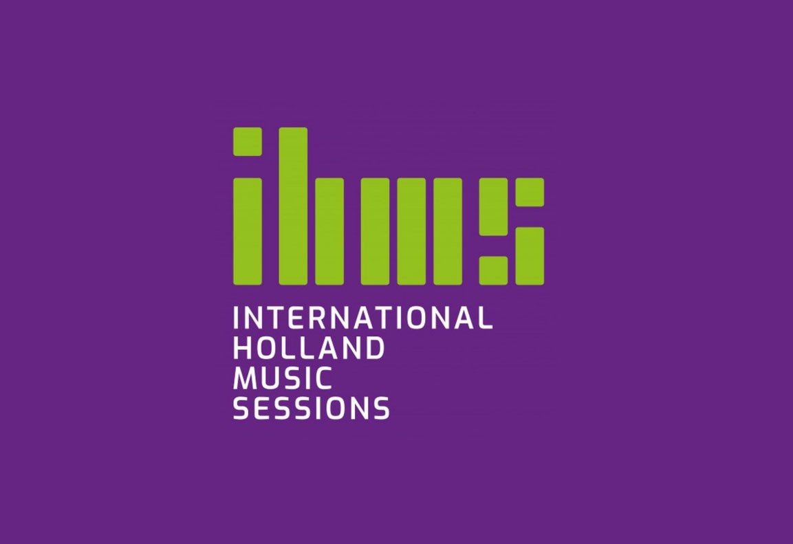
IHMS had an existing identity that had served it well but had grown outdated. The original logo was stiff, conservative, and failed to capture the essence of music’s fluidity and emotion. Additionally, the lime green and purple color scheme was neither inviting nor representative of the organization’s artistic nature. To reinvigorate the brand, we sought a balance between professionalism and youthful energy, ensuring the new identity would stand out in a visually competitive space.
Concept Development
Our approach was rooted in the idea that music is more than just sound, it’s movement, rhythm, and connection. We explored ways to visually express these elements through shapes, geometry, and color. The new identity needed to reflect IHMS’s core values:
Positivity, Passion, Creativity, Professionalism, Diversity, Talent, Growth, Culture, Inspiration, Discipline


The New Logo: Structure Meets Emotion
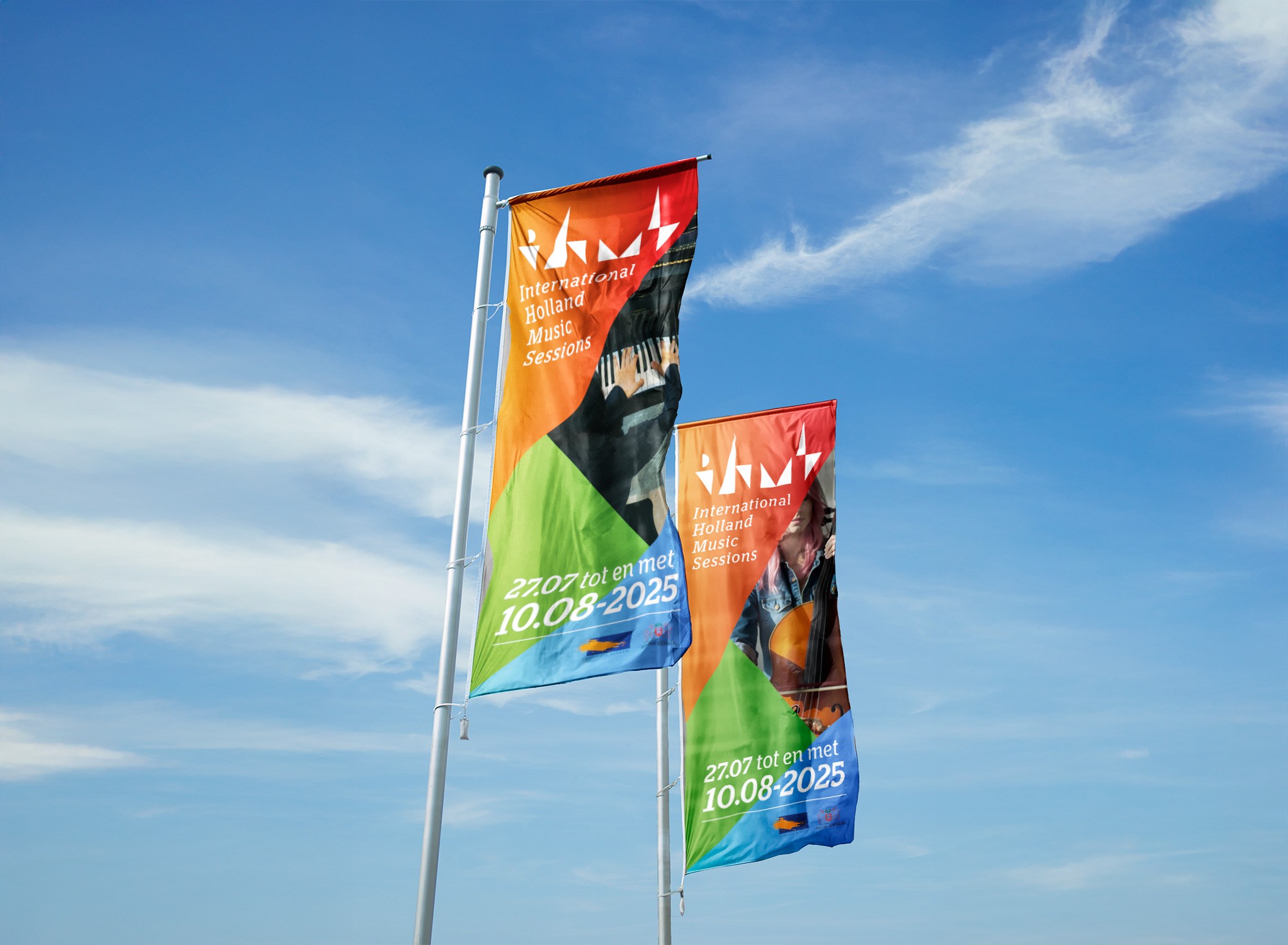
The final logo design is a dynamic representation of the rhythm and structure inherent in classical music. Inspired by musical notation, sound waves, and movement, the design balances precision with artistic expression. It encapsulates the vibrancy of IHMS while maintaining a sense of professionalism.
A Bold, Expressive Color Palette
Color plays a crucial role in how a brand is perceived. We developed a primary color palette that reflects the energy, diversity, and professionalism of IHMS:
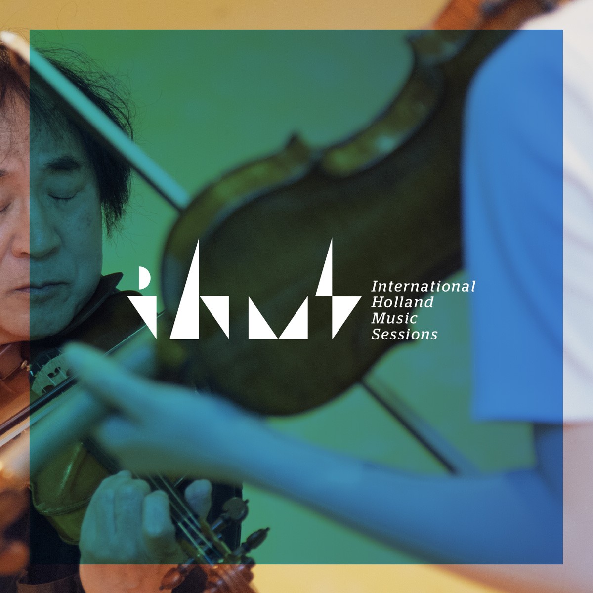
Cerulean Blue (#4A90E2) – Represents stability, discipline, and endless potential.
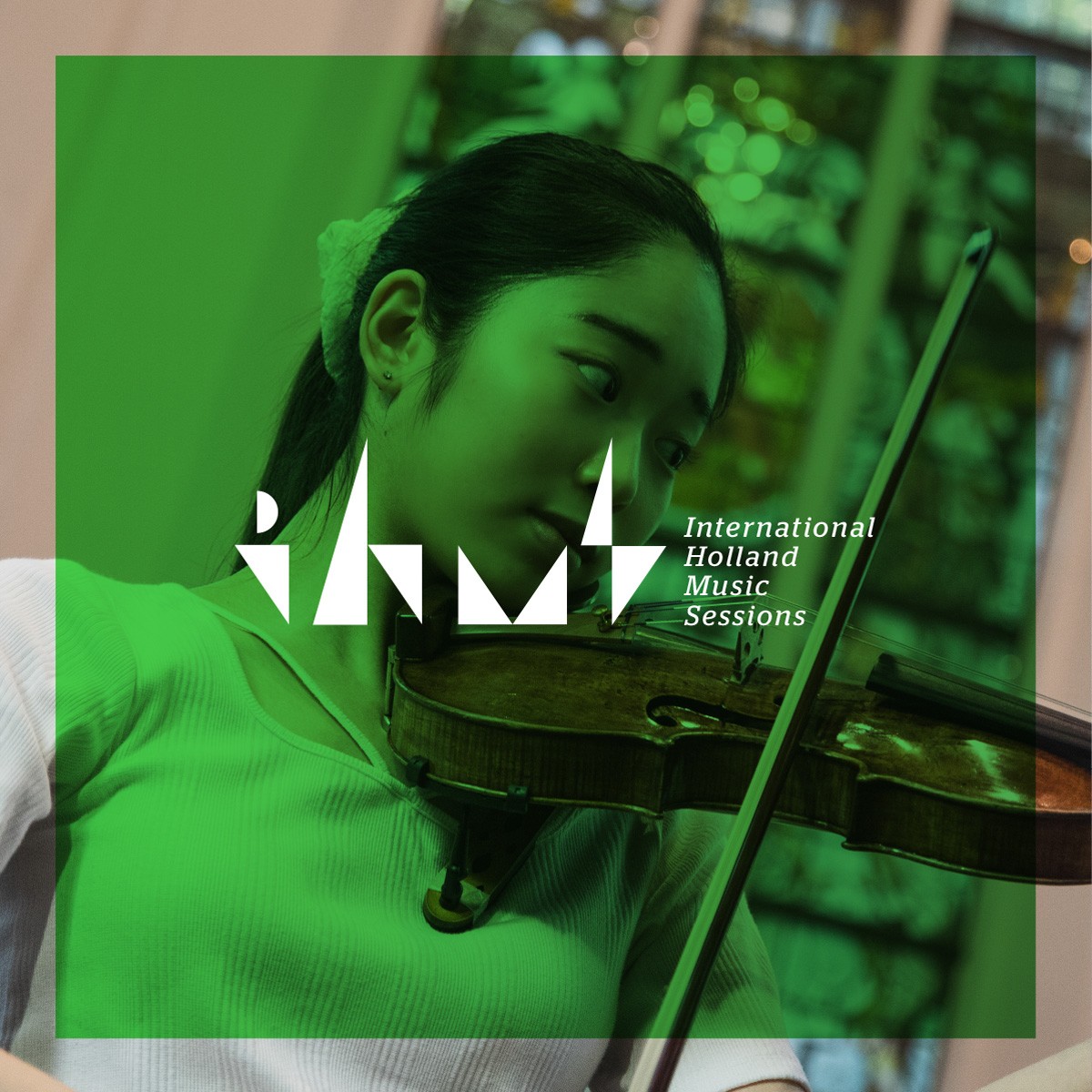
Forest Green (#4CAF50) – Symbolizes growth, harmony, and a nurturing environment.
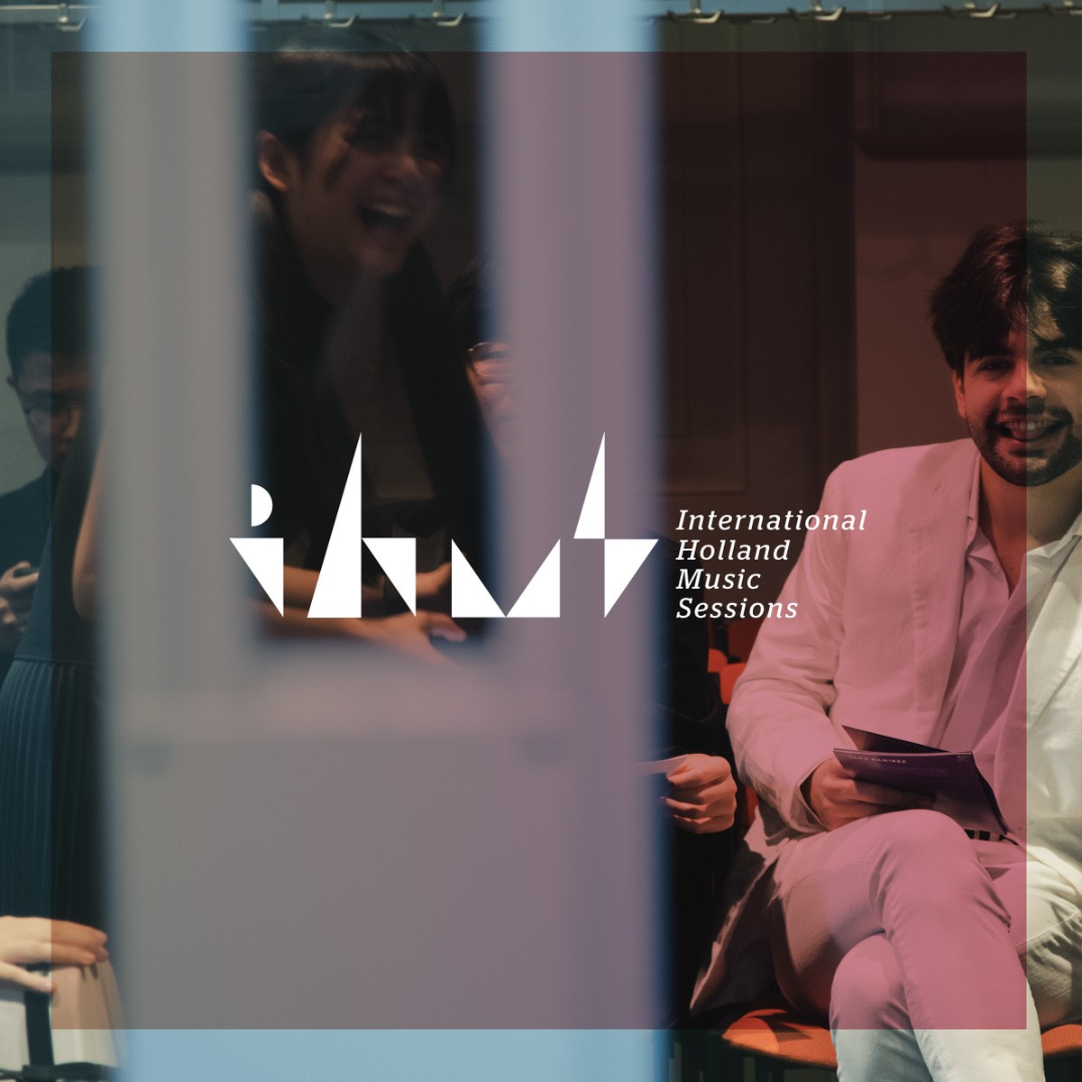
Rosewood Pink (#D9829E) – Evokes creativity, imagination, and artistic freedom.
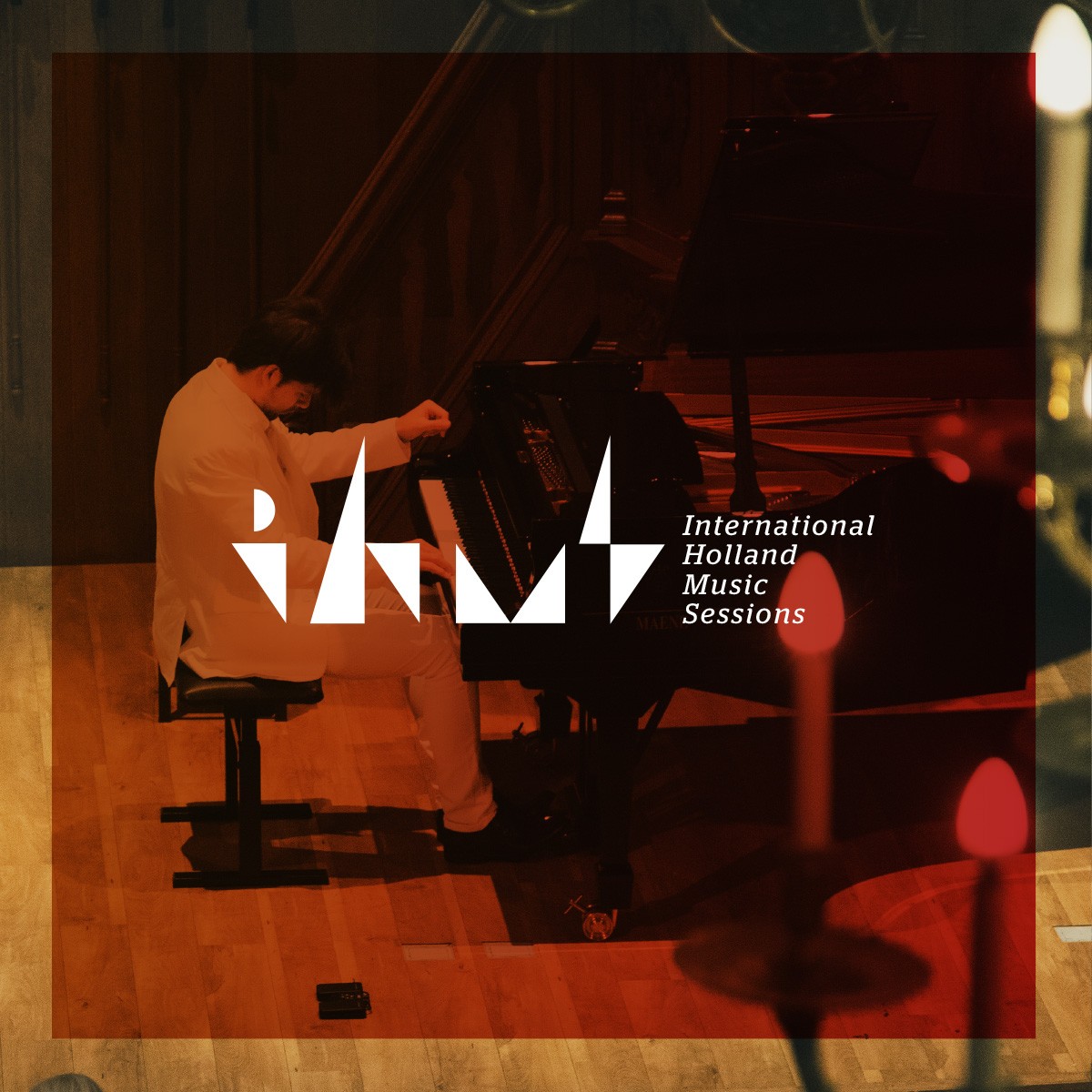
Ruby Red (#C62828) – Stands for passion, performance, and artistic excellence.
Visual Identity: A Cohesive System
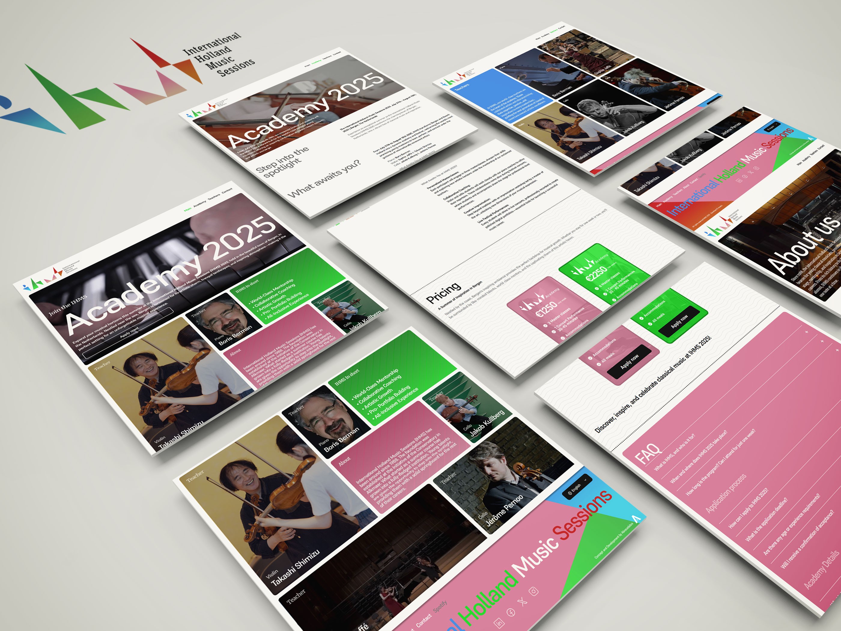
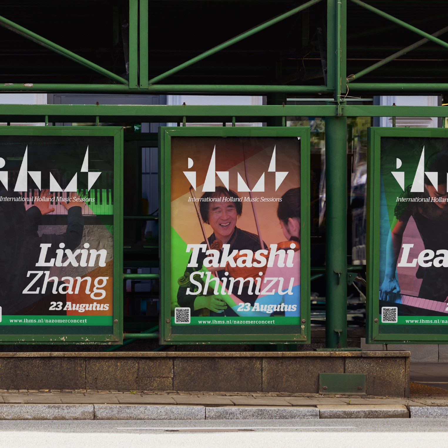
Beyond the logo, we crafted a complete visual system that integrates geometric patterns inspired by rhythm and melody. The structured yet fluid design elements work seamlessly across digital and print communications, reinforcing IHMS’s modernized identity.




The Challenge: Attracting Young Talent
A key objective was to make IHMS more appealing to young musicians while maintaining credibility with its established audience. The previous branding did not speak to the creativity and ambition of emerging artists. Our solution was to inject a sense of dynamism through:
Engaging typography that balances classical refinement with contemporary style.
A flexible grid system that allows for creativity in layouts while maintaining consistency.
A fresh, bold visual tone that emphasizes inclusivity and excitement.
Impact and Reception
The rebrand successfully revitalized IHMS’s image, positioning it as a forward-thinking institution. The new identity communicates professionalism and passion while engaging the next generation of classical musicians. By merging structure with emotion, tradition with modernity, we’ve created a brand that truly reflects the heart of IHMS.
Conclusion
Our rebranding of IHMS was not just about aesthetics, it was about redefining how the organization presents itself to the world. The new identity aligns with its mission of fostering young talent and providing them with an inspiring global platform. With a refined visual language, IHMS is now equipped to continue its journey, nurturing the next wave of musical excellence.


